Continuing from last week, I've spent the time since working on level design (among other things).
The level design is very important for the player's experience of the game, as all of the game's objects, enemies and power ups have close relationships that dynamicly change dependent on the performance of the player.
In Day of the Piñata, the goal of each level is to gain enough revenge points by smashing objects on the level. Another function of the object's destruction is that they drop candy, which the player can pick up. The candy can be used as a projectile to lure away enemies and smash small objects, but losing all of them will cause the player to lose the game. Candy may also be lost if the game's enemies catch the player.
Furthermore, depending on the amount of candy the player has collected, the piñata will change size. The bigger the piñata, the bigger objects may be destroyed. Effectively, this means the candy dropped from objects are used both as an offensive boost or weapon, as well as being the health of the player.
So how does this relate to the level design? Well to begin with, the size system is one of the core features of the game, and it's highly dependent on the placement of objects and enemies. As the level designer, I have to make sure that there isn't too much candy at the player's disposal which allows her to stay in the biggest size and simply rush through the level. Counterwise, I also have to make sure that there isn't to little candy so that the player feels the game is too hard.
This means I have to keep a balance in the amount and placement of both enemies and objects, as well as the lenght of the map and the time and revenge point requirements - a criteria that is bound to take a lot of iteration and testing.
As I'm not one of the programmers I would have a hard time actually testing the levels in-game, so I resorted to the good ol' sketch block. After doing some reading on level design in course literature as well as on the web, I started sketching a simple timeline of a level an placing simple geometrical shapes representing objects and enemies on it, much like I did last week.
The main purpose of this was to get an idea of how the tempo increased and decreased during the level.
Very roughly, by placing down the represenative shapes, I could estimate how the level would play out, and how hard the player would experience it.
For example, a lot of objects but no enemies would probably not stress the player at all as the inanimate objects don't pose a threat at all. If the objects are all very small, the player could smash them all and quickly grow in size, which changed it's relationship with objects and enemies further on in the level.
Increasing both the number of objects and enemies would undoubtely create a tense experience regardless of the player's size.
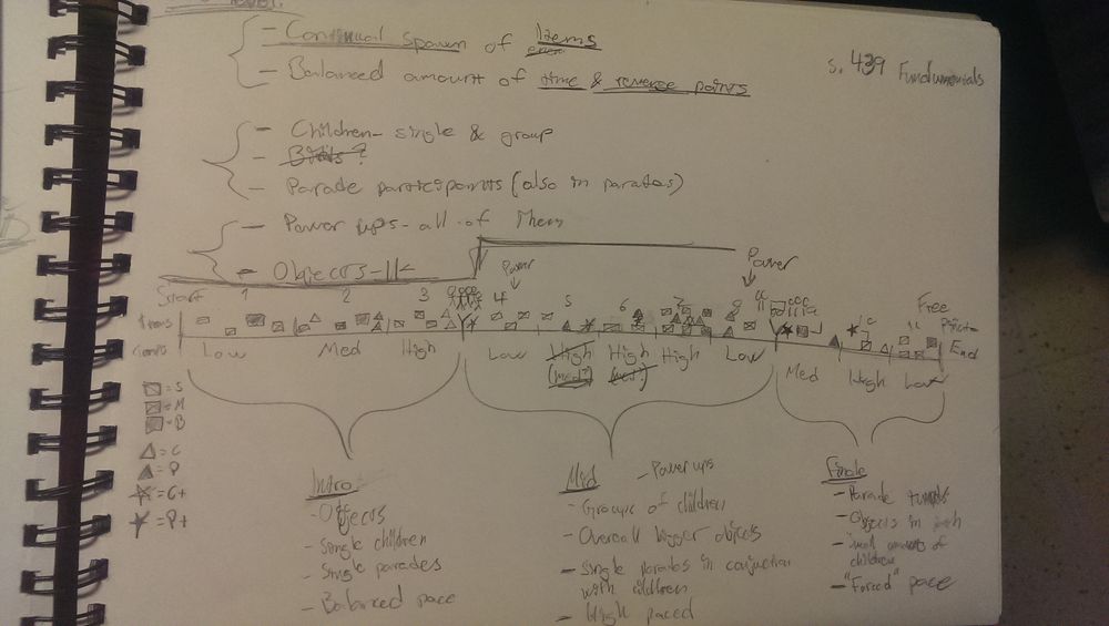
Below I've posted a photo of the notes I've done during the week. While I did not have any plans on making them understandable for anyone else but myself while writing them, I thought I might explain a few of things.
Splitting the paper horizontally at the middle is the timeline. At the top of it, I placed the shapes representing objects and enemies, and at the bottom some notes of the tempo (low, medium or high) at that particular point of the level. At the far left I made a small list of what the different shapes represented, so that I had some form of structure.
I ended up dividing the timeline into sections named intro, mid and finale. What set these apart where the overall tempo, enemies appearing and how much the player could affect the piñata's size.
I will finish the level concept by doing a couple of mock ups of the level in Photoshop to get a grip on the sizes of objects and enemies. This will hopefully give a more detailed picture of how the different layouts I've planned will play out and allow us to start testing them next week.

